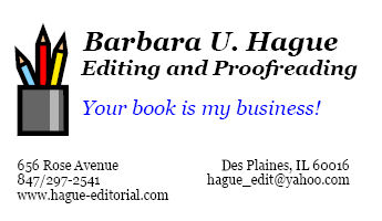
I like this business card because it is simple and there is no question as to what service is being offered. The tagline “Your book is my business” and the pencil cup graphic reinforce the primary message. If I were looking for an editor or proofreader there is no doubt that Barbara Hague would be a person to call. This business card is like a mini-billboard. My only comment is that the address is avant-garde. I would put the address, city, state zip all on the same side with the phone under. Then the URL and, email on the other side. Nice!
