Building a brand is everything, in today’s business environment and this effort requires time and consistency in order to achieve the best results. One of the best ways to build a brand is with business cards.
Business cards are a creative way to share contact information and to showcase who you are and why your services are unique in comparison to your competitors. Almost all professionals have a handy pack of business cards present when building their brand at industry events, but how do you make cards that stand out against the others? When it comes to business cards there is no ‘one size fits all’ approach. For example, graphic designers have a far different brand to build than accountants or real estate agents. Therefore, the business cards of graphic designers should be far different from those of accountants or agents.
So Where Do We Begin?

Creative Services
The design and communications industry is known for having some of the most innovative business professionals around to spawn the next big idea. This particular industry is focused on connection, creativity and products that are aesthetically appealing. Crafting a business card that matches this theme is crucial. When pondering what to feature on one of these business cards, it is essential to consider font, color and spacing.
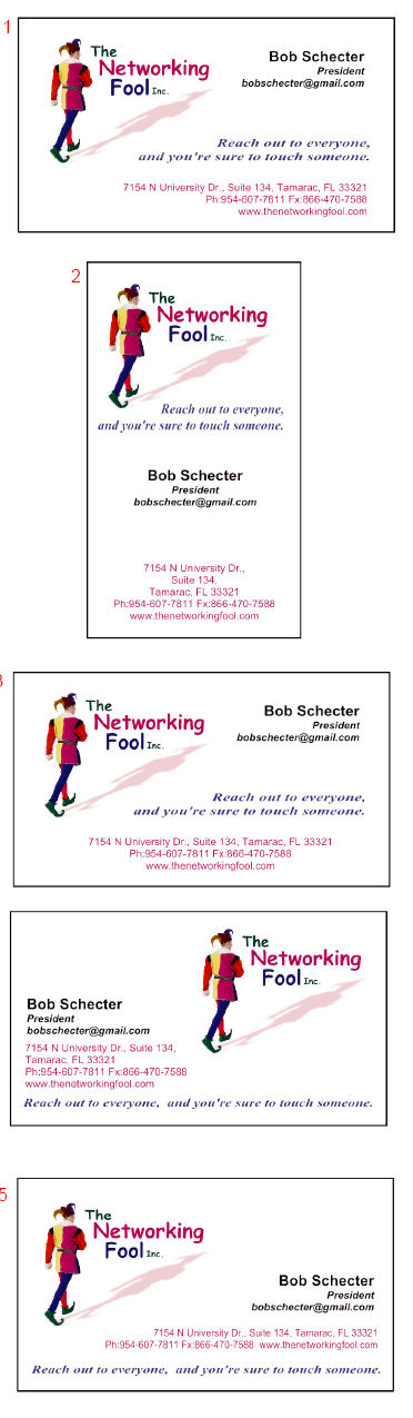
Professional Services
In comparison to the design and communications industry, the professional services industry with individuals such as accountants or lawyers often times requires a more subtle business card to get the job done. For this industry, individuals often stick with dark colors such as grey or black against a neutral background. However, there are instances where color and design play a role with these cards as pictured below.

Service Sector
For those who work in the service industry, it is recommended that elements such as the shape of the card should be considered when crafting the perfect design. If you are a stylist, use scissors or a hairdryer as the shape for your card. If you are a clown include pictures of balloons and use bright colors, and if you are a party planner make your cards in the shape of invitations.
Bottom Line
Think of business cards like a cover letter. This is your window to show personality and create a lasting impression on the contact that matters most. The more business cards you hand out, the more potential clients, partners and industry contacts will be aware of your services and, more importantly, your brand.
###
Designline Graphics is the premier resource for high-end business cards, custom Silkcards, plastic cards and promotional marketing needs. To learn more visit 4colorprint.com.
 By Nina Interlandi Bell – Guest Blogger
 Letterpress printing has been around since about 1400, and was the primary method for the print industry until it was replaced by offset in the early 20th century. The presses themselves, giant behemoths made of cast iron and gears, aren’t even made anymore. It’s a matter of will and determination to find them, restore them, learn to print with them, and maintain them. The results, however, are definitely worth the effort. For each print I do, a plate is inked with rollers, the paper is placed by hand into the press, cranked to imprint against the image, and then trimmed to size. If a print requires more than one color, the press is cleaned, re-inked, and another pass is done using the same piece of paper. The result is a much more tactile experience. When you hold a letterpress business card in your hand, you can feel the impression the artwork has made into the paper. It feels like something special. Not just any paper receives a deep impression well, so letterpress pieces are frequently printed on exceptionally thick, soft stocks.
 The bottom line is, if you’ve found a way to get people looking at your business card and remembering you more than the other guy, you should take advantage of it. I’m not talking about a funny shaped card that can be awkward, a cheeseburger scented card, or giant neon popout print. A subtle texture, impressive use of negative space, and a sensuous cotton paper are sometimes all it takes to get someone’s attention. Letterpress printing isn’t the only option, but a good design and proper print choices are essential. I find that the people I enjoy doing business with the most are the ones who are really good at what they do, and can also recognize when it’s time to pay someone else for their expertise in another area. I’d never try to give myself brain surgery just to save a couple bucks, so don’t try and kludge together a clip art design on perforated cards from your office laser printer instead of consulting a professional. Good design is worth every penny, and you shouldn’t leave home without it.