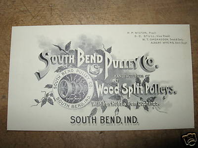
Designers today can take a tip from many of the business cards printed in the 19th and early 20th Century. These cards are full of information and presented in an artistic manner that is simply lacking today in spite of our advanced technology. Much of this may be due in part to the aesthetics of the post modern era and the idea of “less is more.” But look at the sense of balance combined with attention to detail and shear artistry exhibited in this example provided by Halcyon Rare Books of Adams, TN. The cards of this era were painstakingly etched, reflecting the craftsmanship of their time, with great care to faithfully represent the product being sold and to convey an image that would resonate with the intended customer.

Vinatage Business Card - South Bend Pulley
This example of South Bend Pulley proudly announces its business as manufacturers of Wood Split Pulleys with Iron Hubs and Iron Bushings; no doubt the state-of-the art pulley technology of the day. The card displays the names and titles of each of the company’s key personnel, includes a detailed drawing of its product and presents it all on a decorative bed of roses adding a sense of elegance and good taste to an otherwise cold and industrial enterprise. The shaded hand drawn font is effective and unique.
The main criticism I have of this card is the repetition of the “South Bend” which appears four times on the card. Arguably the redundancy may be there to reinforce the name however the South Bend, IND on the bottom of the card could have easily been left off with no harm to the message. In fact it appears to me to have been an afterthought as it is perilously close to the bottom and is rendered in a font that is less delicate than the rest of the card.
I believe this is a business card that company president M.F. Milton would have been proud to hand out when calling on captains of industry who might be in a position to use his product. It is important to note that people do business with other people and this card suggests that he and his associates are Victorian gentlemen of refinement.
Photo courtesy of www.HalcyonRareBooks.com .

Hello,
Thank you for sharing all of your interest in business cards. I have really enjoyed looking around on your site.
In regards to the Southbound Pulley Co. card, while I do agree that there is some overkill, do you think the SOUTH BEND, IND. maybe refers to the town of South Bend Indiana? Just a guess, I don’t know if there is such a town. But whatever, it really is a fine specimen, very inspiring, thanks for sharing it.
By the way, a friend of mine collects business cards, and every once in a while, he pulls them out, and we sort through, and pick out of favorites, which we then have to defend on their various merits. Always suprising how different our values are..
but a fun game, which I am sure you have played your self.
Best regards, Travis Cohn
Travis – I am certain that IND stands for Indiana. I belive my thought was since it was also in the logo why have it again, since it seems to crowd the card and distract from the design. It is indeed fun to look at the these old cards and see how the style of business and the printing techniques have changed over the years. Thanks for your comment.